Learn how to make your visuals easier to understand and reduce mental strain in order to effectively communicate your message.
Learning outcomes:
- Know the basic principles of Gestalt psychology
- Apply the basic rules of decluttering
- Know the basic principles of Gestalt psychology
- Apply the basic rules of decluttering
Introductive videos
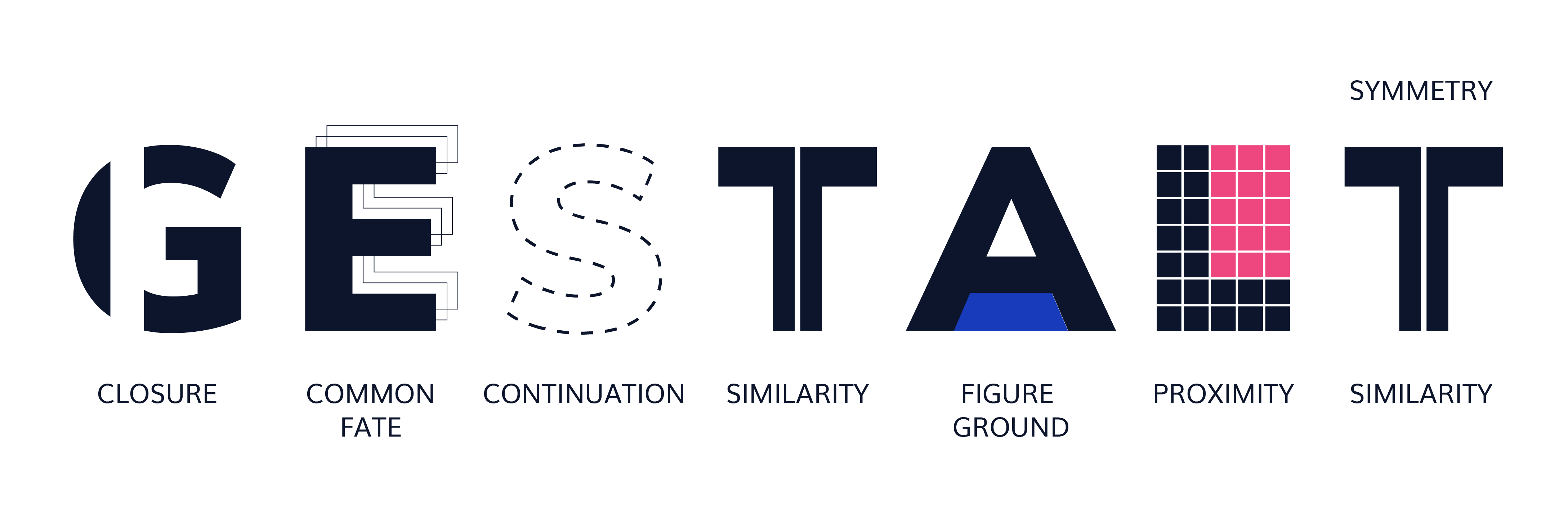
From Gestalt Principles to Data Visualisation
Here are some principles from the theory of gestalt psychology that you should consider when designing visualizations:
- Enclosure refers to the tendency to perceive elements that are surrounded by a visual boundary (such as a rectangle or an ellipse) as a group. This principle can help the viewer see the structure and organization of a visualization, and also create a sense of emphasis or hierarchy. For example, you can use a circle or a square to enclose a set of data points in a scatter plot, to show that they belong to the same group or category.
- Closure refers to the ability to perceive a whole or complete figure even when it is incomplete or partially occluded. This principle can help the viewer see patterns and relationships in a visualization, and fill in the gaps when necessary. For example, you can use closure to show the shape of a curve in a line graph, even if some data points are missing.
- Common fate refers to the tendency for elements that are moving in the same direction or at the same speed to be perceived as a group. This principle can help the viewer see patterns and relationships in dynamic or temporal data. For example, you can use a streamgraph to show the evolution of multiple categories over time, and use common fate to group the categories that have similar trends.
- Continuation refers to the tendency to perceive elements that are aligned or connected as a group. This principle can help the viewer see patterns and relationships in a visualization, and follow the flow of the data. For example, you can use continuation to show a trend or a progression in a time series plot, by using dotted lines instead of solid lines to connect the data points. This helps to avoid visual overload and allows the viewer to focus on the general direction of the data.
- Similarity refers to the tendency to perceive elements that have similar characteristics (such as color, shape, or size) as a group. This principle can help the viewer see the connections between the elements and understand the meaning of a visualization. For instance, you can use different shades of the same color to represent different levels of a categorical variable in a bar chart.
- Figure ground refers to the ability to perceive an object (the “figure”) against a background. The brain tends to assign a figure status to the most prominent or distinctive element in a visual field, while the other elements are perceived as the background. This principle can help the viewer see the hierarchy and structure of a visualization. For example, you can use figure ground to emphasize the main message or key findings in a chart, by using a clear and prominent title and labeling the axes appropriately.
- Proximity refers to the tendency to group elements that are close to each other. This principle can imply a relationship between the elements and help the viewer see the structure and organization of a visualization. For example, you can use proximity to show that a set of data points belongs to the same category in a scatter plot.
- Symmetry is not considered to be one of the main principles of gestalt, but it can be used as a formatting tool to assist in the perception of information. Symmetry can be used to create harmony and order in a data presentation, by organising elements so that they are symmetrical or by using a symmetrical layout structure. However, it is important not to overload the space with too much symmetry, as this can distract attention from the content and make the presentation less readable.
In addition to these principles, you should also consider the following general guidelines:
- Don’t be afraid of using white space. Using white space in a data visualisation can help create clarity and avoid information overload. It is important not to fill every available space with content and to leave white space to help with readability.
- Align your elements consistently. Alignment is an important formatting tool that can help the clarity of your visualisation. By aligning your elements consistently, you create a visual structure that makes it easier to understand the information.
- Use contrast wisely. Contrast is a powerful tool that can help highlight important information and grab the attention of your audience. Use contrast wisely in your visualisation to highlight the most important elements and to create visual interest. However, it is important not to overload your visualisation with too much contrast, as this can become distracting and detract from understanding
Now that you have in mind the basic principles of human perception, it is a matter of applying these teachings to the visualization of your data.
Recommended reading Clutter is your enemy! (chapter 3), Storytelling with Data: A Data Visualization Guide for Business Professionals. Cole Nussbaumer Knaflic. John Wiley & Sons, 2015.
Recommended reading The Basics (pages 28-33), The Wall Street Journal Guide to Information Graphics – The Dos and Don′ts of Presenting Data, Facts, and Figures. Dona Wong. W. W. Norton & Company, 2014.