- Select a graph that is appropriate for the data and the message you want to convey.
- Understand how to visually represent different types of graphs using best practices
Introductive videos
The various types of visuals
After identifying your audience and determining the message you want to convey, it is important to choose an appropriate way to present the information. There are three options:
- Use tables: They allow people to focus on specific rows and columns, but if you are giving an oral presentation, your audience may be distracted by analyzing the table and stop listening to you. One solution is to use a heat map in conjunction with the table.
- Use graphs: There are many types of graphs to choose from, and the challenge is to select the appropriate representation.
- Use computer graphics: This gives you a lot of freedom, but it is often tempting to prioritize aesthetics over accuracy or clarity. This approach will not be covered in this course.
Recommended reading Choosing an effective visual (chapter 2), Storytelling with Data: A Data Visualization Guide for Business Professionals. Cole Nussbaumer Knaflic. John Wiley & Sons, 2015.
Recommended reading Visual Vocabulary, https://www.tableau.com/solutions/gallery/visual-vocabulary
The following image includes a decision tree to help you choose a suitable representation. You will also find two interactive tools below that can assist you in this process.
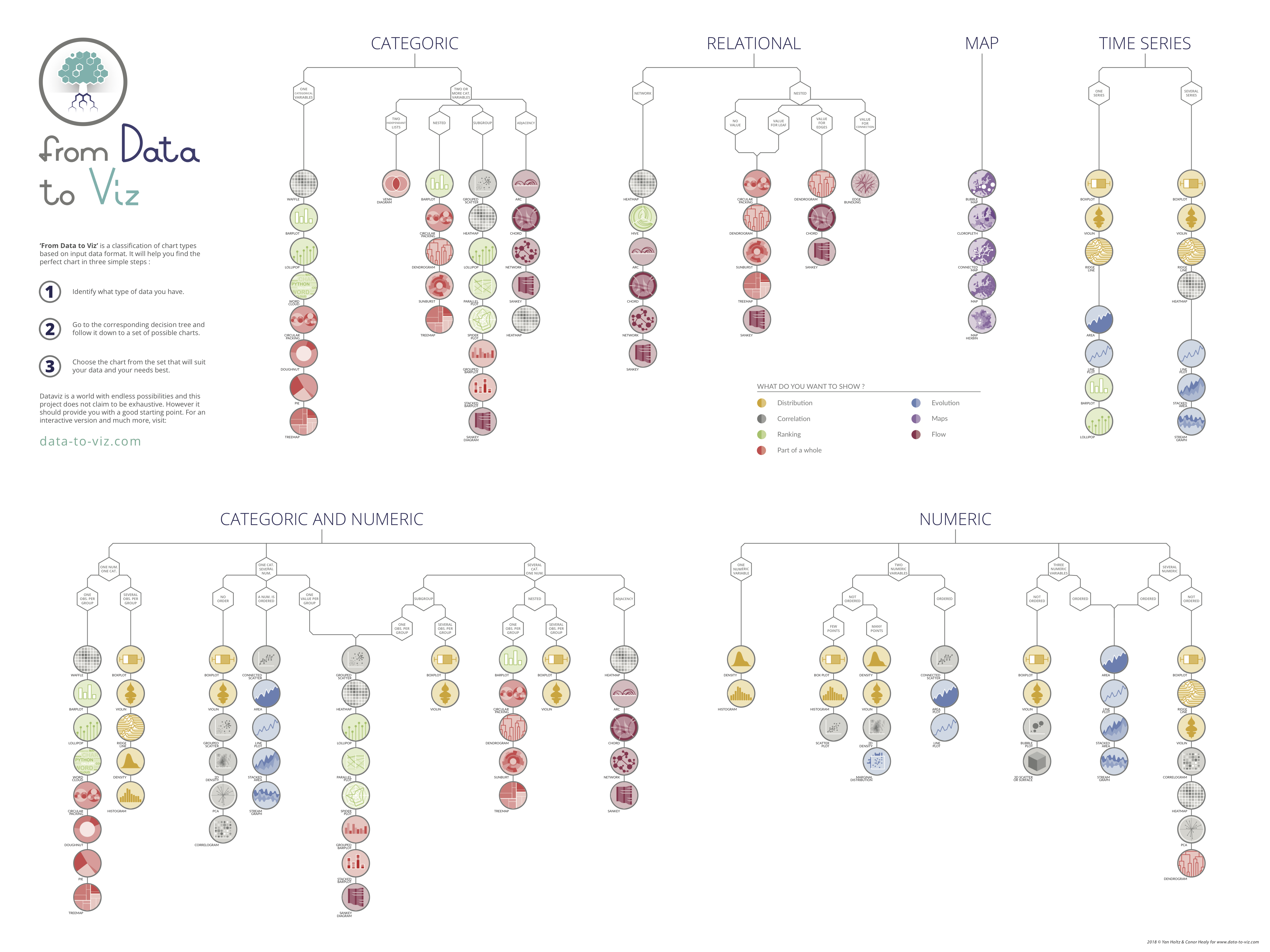
Recommended tool An interactive decision tree to guide you. https://www.data-to-viz.com/#explore
Recommended tool Interactive chart chooser. https://depictdatastudio.com/charts/
Recommended reading Highlight Tables and Heatmaps, https://www.tableau.com/data-insights/reference-library/visual-analytics/tables/highlight-tables-and-heatmaps, (updated: 2022/01/05)
## The good way to make visuals If you need to remember three things, avoid using 3D graphics, avoid pie charts (and all graphs that require comparing areas or angles), and make sure you are clear about your axes (use only one vertical axis and always include a zero baseline). The reference provided below, written by Dona M. Wong, the graphics director at the Wall Street Journal, expands on these recommendations made by Cole Nussbaumer for various types of graphics. It's important to follow good practices when creating graphs, so make sure to follow these guidelines consistently to make them second nature.Recommended reading Chart Smart (chapter 2), The Wall Street Journal Guide to Information Graphics – The Dos and Don′ts of Presenting Data, Facts, and Figures. Dona Wong. W. W. Norton & Company, 2014.
Another common challenge is selecting colors. The saying "there's no accounting for taste and color" does not apply in this context because there are also good practices to follow when choosing colors. Take a look at the following image. Which graph do you prefer?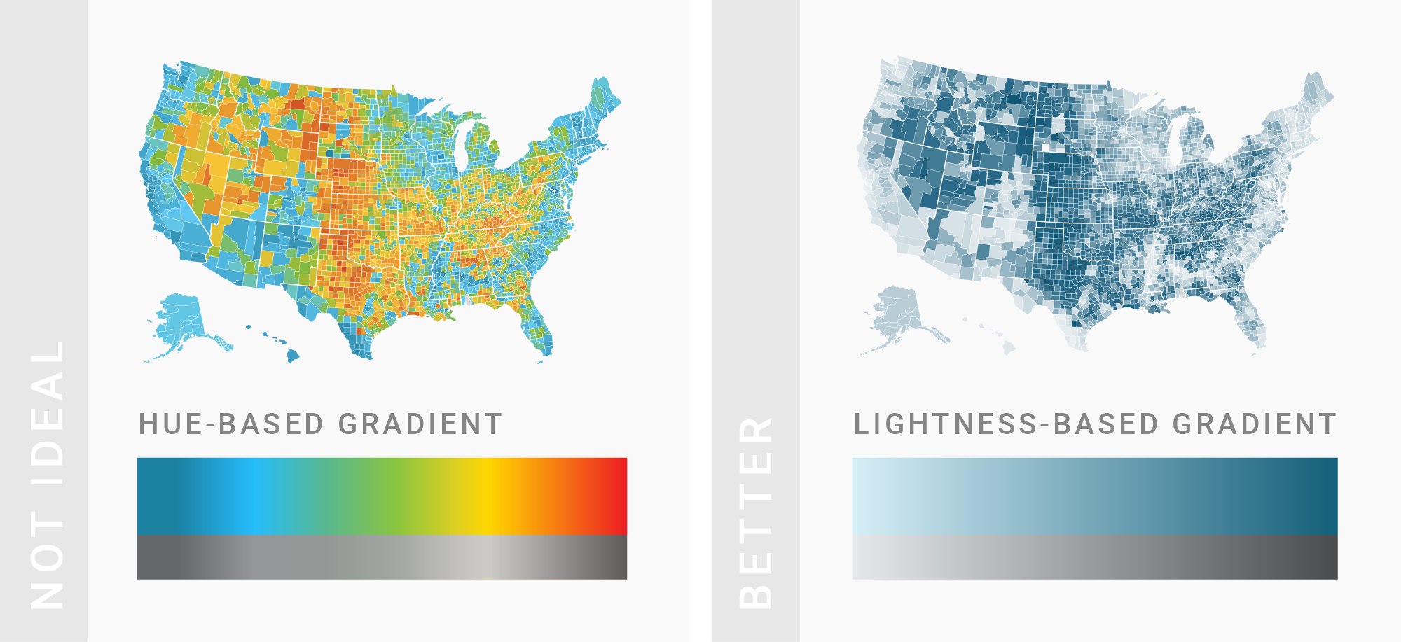
Recommended reading What to consider when choosing colors for data visualization, https://academy.datawrapper.de/article/140-what-to-consider-when-choosing-colors-for-data-visualization, (updated: 2019/12/6)
Recommended reading How to use the color palette tool for choropleth maps, https://academy.datawrapper.de/article/132-how-to-use-the-color-palette-tool, (updated: 2019/12/6)
Recommended reading The Basics (pages 36-47), The Wall Street Journal Guide to Information Graphics – The Dos and Don′ts of Presenting Data, Facts, and Figures. Dona Wong. W. W. Norton & Company, 2014.
Finally, colors are also an important way to attract attention and focus on certain data: this will be the subject of a future [activity](attention_concept.html)! ## To go further Examine the following two maps that show the number of deaths from Alcohol Use Disorders. How would you compare these two maps? In addition to selecting an appropriate representation and color, you must also consider the relevant indicator and the value scales used. Read Mike's blog article to find out his thoughts on this issue.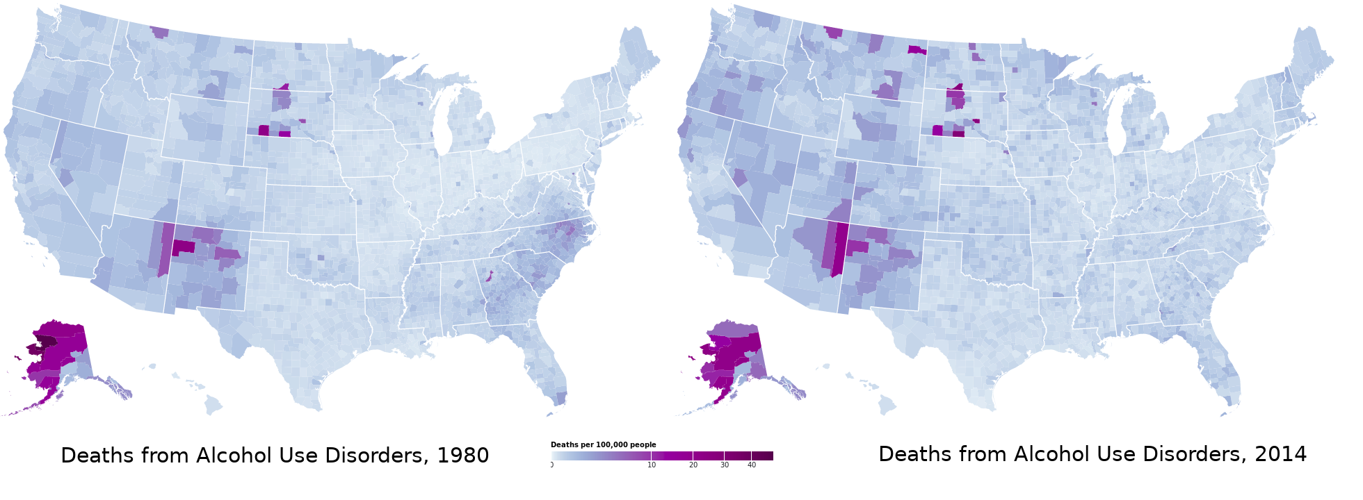
Recommended reading Methods of Comparison, Compared, https://observablehq.com/@mbostock/methods-of-comparison-compared, (updated: 2019/12/6)